Win the Conversion: A Conservative Guide to High-Impact Political Landing Pages
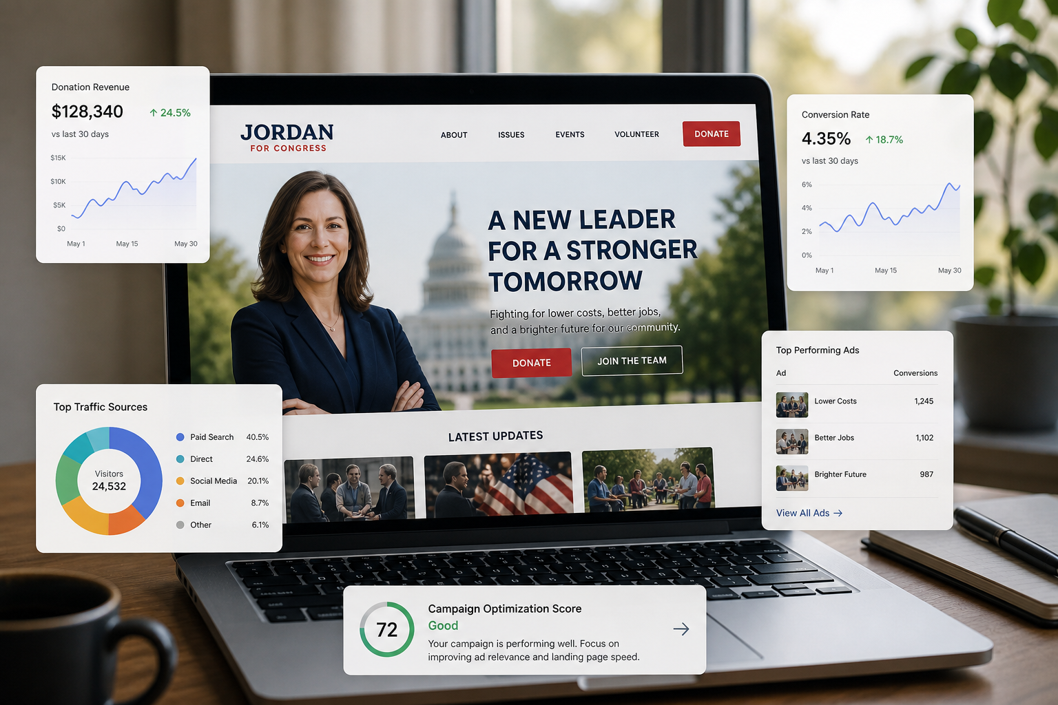
Your Ad Got the Click. Now What?
In digital campaigning, driving traffic is only half the battle. A voter who clicks your ad has shown interest, but that interest is fleeting. The critical moment of conversion—when a potential supporter becomes a donor, a volunteer, or a subscriber—happens on your landing page. Too many campaigns waste significant ad spend by directing engaged voters to generic homepages or poorly optimized forms. A dedicated, high-performing landing page is not a luxury; it is a fundamental tool for maximizing return on investment and building a formidable grassroots army.
For conservative campaigns, where every dollar must be stretched to counter a hostile media environment, optimizing this conversion point is paramount. A well-crafted landing page respects the voter's time, reinforces your core message, and provides a frictionless path to action. It is the digital handshake that turns passive interest into active support.
The Anatomy of a Landing Page That Wins
An effective political landing page is built on a foundation of clarity, trust, and a single, unwavering focus. Before a single line of code is written, your team must understand that this page has one job. Everything on it must serve that purpose.
1. Message Match: The First Rule of Trust
When a voter clicks an ad that promises to “Help Secure Our Borders,” the landing page headline they see must echo that exact sentiment. Any disconnect between the ad copy and the landing page content creates immediate distrust and confusion, causing bounce rates to skyrocket. This alignment, known as message match, is the cornerstone of a successful conversion funnel. It assures the visitor they are in the right place and that your campaign is credible and consistent. Your headline, subheadings, and body copy must all work in concert to reinforce the value proposition presented in the initial advertisement.
2. One Page, One Goal: The Power of a Singular Call to Action (CTA)
A common mistake is to overwhelm visitors with choices. A landing page should not ask for a donation, a volunteer signup, and a newsletter subscription simultaneously. This creates decision paralysis. The most effective landing pages are built around a single, clear objective.
- If the goal is fundraising, the entire page—from the headline to the imagery to the copy—should drive the user toward the donation form.
- If the goal is collecting emails, the page should focus on the value of signing up, whether it’s exclusive updates or joining a specific coalition.
Remove all other distractions. That means no navigation menu, no links to other parts of your website, and no competing requests. The voter should have only two options: complete the desired action or leave the page.
3. Frictionless Design: Pave the Way for Action
Every field on a form, every extra click, and every second of load time is a point of friction that can cost you a conversion. Your design must be relentlessly focused on making it as easy as possible for the user to act.
- Mobile-First is Non-Negotiable: With a significant portion of web traffic coming from mobile devices, per data from sources like StatCounter, a landing page that is not perfectly optimized for a smartphone is effectively broken. Test your pages rigorously on various devices.
- Simplify Your Forms: Only ask for the information you absolutely need. For an email signup, you only need an email address. For donations, platforms like WinRed have streamlined the process, but ensure your form is still as short as possible. For longer forms, consider a multi-step approach that breaks the request into smaller, less intimidating chunks.
- Load Speed is Crucial: Slow-loading pages are conversion killers. Optimize your images, use a quality hosting provider, and keep scripts to a minimum. A page that takes more than a few seconds to load is losing supporters you paid to attract.
Data-Driven Optimization: From Guesswork to Certainty
The most successful digital campaigns do not rely on intuition alone. They test, measure, and refine every element of their strategy. Your landing pages are prime candidates for this data-driven approach.
1. A/B Testing: Let the Voters Decide
A/B testing involves creating two versions of a page with one element changed—such as the headline, the button color, or the primary image—and showing each version to a segment of your audience. By measuring which version converts at a higher rate, you can make informed decisions that incrementally improve performance over time. Test your assumptions. The headline you think is most powerful may not be the one that actually motivates voters to donate.
2. Install Your Tracking Pixels
Before launching any ad campaign, ensure your tracking pixels (from platforms like Facebook, Google, and others) are correctly installed on your landing pages and thank-you pages. This is the only way to accurately measure your cost per acquisition (CPA), track conversion rates, and understand the true ROI of your ad spend. These pixels are also essential for building retargeting audiences—allowing you to serve follow-up ads to users who visited your page but did not complete the desired action.
The Final Word: A Strategic Imperative
In the modern political arena, a campaign’s digital presence is as important as its ground game. Your landing pages are the front lines of that digital operation. By focusing on message consistency, a singular call to action, frictionless design, and rigorous data analysis, conservative campaigns can build powerful conversion engines. These pages are more than just web forms; they are strategic assets that build trust, mobilize support, and provide the resources necessary to secure victory.